Food and beverage labels need to do two jobs at once: survive the real world, and get the product over the line commercially. For NZ producers that can mean a sauce bottle in ambient retail, a yoghurt pottle in a chilled cabinet, a frozen ready meal at -18C, or a kombucha bottle sweating in a cafe fridge. The Label Room prints custom food labels and beverage labels for all of it, from short launch runs through to supermarket-volume repeats, with FSANZ basics checked at prepress and colour held across digital and offset.
Food labels for the products NZ producers actually sell
We print self-adhesive food packaging labels for:
- Sauces, condiments and dressings
- Snacks, confectionery and chocolate
- Dairy, yoghurt and chilled desserts
- Ready meals and frozen foods
- Bakery and pantry goods
- Juice, soft drinks, kombucha, sparkling water and RTD coffee
- Multi-SKU flavour ranges, seasonal launches and export variants
That matters because buyers do not all search the same way. Some search “food labels NZ”. Others search “sauce bottle labels”, “frozen food label printing”, “kombucha labels”, “drink bottle labels”, or “nutrition panel labels”. A page built to win organic traffic needs to reflect those real use cases, not just the head term.
Why food and beverage brands choose us
Food work is less forgiving than most label categories. If the stock fails in condensation, if the adhesive lifts in a chiller, or if the nutrition panel is unreadable at proof stage, the label is not doing its job. We work with launch-stage producers, contract manufacturers and established supermarket suppliers, so the conversation is usually practical from the start: what the product is, where it will sit, how it will be applied, what the run length is, and which parts of the artwork carry compliance risk.
What tends to matter most to buyers:
- A stock that matches the storage condition. Chiller, freezer, pantry and oil-contact products all behave differently.
- A clear run-length recommendation. Small digital runs for launch, offset when the volume justifies it.
- Confidence on FSANZ basics. Not legal advice, but a prepress check before the job gets expensive.
- Colour consistency across repeat orders. Important when one SKU scales into supermarket and the rest of the range follows later.
- Fast quoting and clear proofing. Most producers are juggling launch dates, co-packers and retailer deadlines.
Built for the chiller, the freezer and the pantry
Food labels live in a wider range of conditions than almost any other category. A pantry sauce sits dry on shelf for months. A chilled dip picks up condensation every day. A frozen product stays at -18C for long periods. Chocolate, butter and nut products introduce oils that can undermine the wrong paper stock over time. The label has to keep its shape, adhesion and legibility through all of that.
Three stock paths cover most food and beverage work.
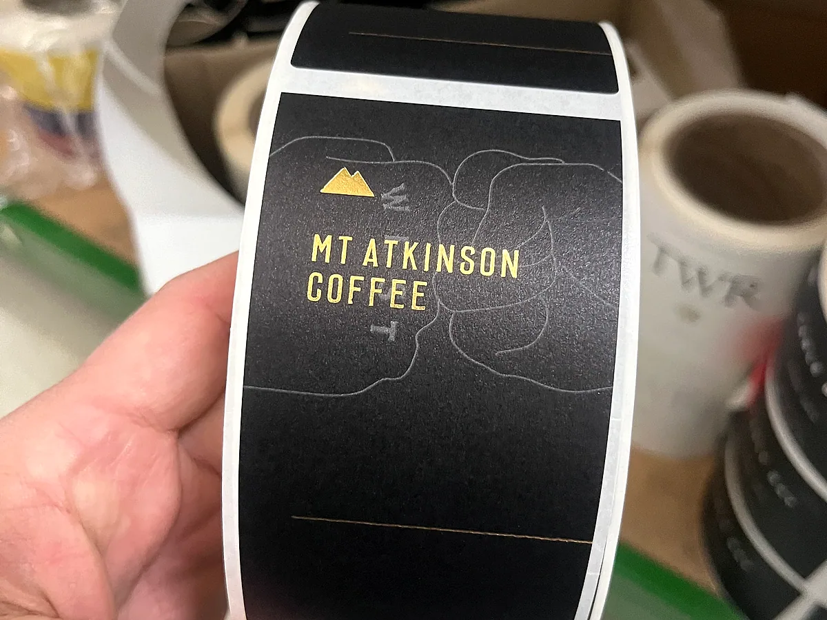
- White and clear BOPP. The food workhorse. Fully synthetic, oil and water resistant, dimensionally stable through chiller and freezer cycles. Default for sauces, dressings, ready meals, dairy and chilled snacks. Clear BOPP delivers a no-label look on premium glass.
- Treated uncoateds. When a brand wants a paper aesthetic on a chilled or wet product, untreated paper falls apart. Treated uncoateds keep the paper look with condensation resistance built in. Common on premium chocolate, artisan condiments and chilled bakery.
- Coated and uncoated papers. Best for dry pantry goods where the brief is more about shelf feel than moisture resistance.
Adhesive choice matters as much as facestock. Cold-application adhesives are standard on chiller and freezer jobs, and we will usually ask how the labels are being applied, by hand or machine, before we sign off the spec. We don’t run thermal transfer stocks. The press heat on our offset runs is too high. If you need overprintable stock for downstream coding, we will point you to the right alternative.
FSANZ compliance baked into prepress
Food labelling in NZ runs to the FSANZ Code. That means the label artwork has to carry the required information before the product can legally sit on shelf. Compliance review is part of prepress on every food job before plates or proofs go out.
What we check at prepress:
- Nutrition information panel. Format, layout and minimum type sizes, structured to FSANZ requirements rather than a designer’s preference.
- Allergen disclosure. Common allergens flagged in bold inside the ingredient list, with “contains” or “may contain” statements where appropriate.
- Ingredient ordering. Listed by descending weight, with compound ingredients broken out where the rules require it.
- Country of origin labelling. Mandatory for most food categories sold in NZ.
- Mandatory warning statements. Where they apply, for example unpasteurised products or those carrying caffeine.
- Claim wording. Nutrition and health claims have substantiation rules. A phrase a marketing team likes can fail compliance even when the product itself passes.
We’re not a regulatory consultant. If a label is borderline, we’ll flag it and point to the source rather than sign it off. The longer write-up sits in the NZ food labelling requirements guide.
For a first supermarket pitch or a new SKU, this check helps catch layout and compliance issues before labels reach proof or press.
Custom food label printing by product type
Different products fail in different ways, which is why a generic custom-label page usually underperforms.
- Sauce and condiment labels. Need oil resistance, strong adhesion and legible mandatory information on often small containers.
- Frozen food labels. Need freezer-compatible stocks and adhesives that stay down at low temperature.
- Dairy and chilled labels. Need condensation resistance for cabinets, fridges and cold supply chains.
- Snack and confectionery labels. Usually balance premium shelf presentation with efficient repeat runs across multiple flavours.
- Drink bottle labels. Need wet-strength performance plus good colour consistency across flavour variants and pack formats.
That gives the page more chances to rank for the long-tail searches buyers actually use while still supporting the main “food labels NZ” term.
Print method by run length: digital, offset, and how colour stays the same
The choice between digital and offset comes down to run length, SKU count and unit economics. We run both in-house and the same food label can come off either press at the same colour.
Digital is the call for runs from 100 labels up to a few thousand: launch batches, seasonal flavours, market testing, limited collabs and recipe variants. Multi-flavour ranges are where digital earns out. A chocolate maker with 12 SKUs at 600 labels each can run them off one setup with artwork swapped per SKU and no plate cost against each flavour.
Offset starts making commercial sense at roughly 10,000 labels per SKU. That covers established food brand core ranges and supermarket lines. The exact crossover varies with stock, colour count and label size, so if your run is near the threshold, send the spec and we’ll price both methods side by side.
UV-cured offset runs on our hybrid press in our Auckland factory, with the digital press alongside as a separate machine. Shared colour targets are part of why colour holds across offset and digital, with the digital press colour-matched to the same Pantone references.
Take an Auckland hot sauce founder with a flagship habanero at 25,000 a year through supermarkets, a chipotle variant at 14,000, and three limited collab flavours at 400 each. The flagship and chipotle run offset for the unit cost. The collabs run digital, printed to match the core range so the full lineup still reads as one family on shelf.
What helps this page convert organic traffic
Organic traffic only matters if the page answers the buyer’s next question. For food and beverage, that usually means:
- Can you handle my product category?
- Will the label survive the storage condition?
- Can you help us avoid compliance mistakes?
- What run size makes sense?
- How fast can you turn it around?
Those answers should sit on the page before the visitor has to contact sales. That is why the FAQ, material guidance and compliance section matter here more than generic brand language.
Stocks and finishes for food labels
Substrate choice carries as much weight as finish on a food label. The brief pulls in two directions: survive the storage condition, and read on shelf against bigger brands.
- White and clear BOPP. The food workhorse. Oil, water, chiller and freezer compatible. Default for sauces, dressings, dairy, ready meals and snacks.
- Coated and uncoated papers. Semi-gloss, matte and uncoated paper for shelf-stable dry goods: confectionery, biscuits, dry pasta, pantry SKUs.
- Metallised films. Premium chocolate, premium snacks and supermarket positioning where the brief wants shine without full hot foil.
- Treated uncoateds. Paper aesthetic that survives chiller and condensation. Premium chocolate, artisan condiments, chilled bakery.
- Clear films. The no-label look on premium glass jars, bottled condiments and cold-pressed juice.
Hot foil stamping (gold, silver, copper, custom) suits premium chocolate, gift confectionery and reserve lines. Embossing and debossing add tactile depth where a brand is fighting shelf attention against multinational competition. Spot UV picks out a flavour panel or a logo against an otherwise matte ground. Matte lamination reads as restrained, gloss leans bold. For long ingredient lists, export SKUs in multiple languages and regulatory-heavy products, we help make the required copy readable before the label goes to proof.
Proof points buyers expect before they enquire
This page would convert better again with real proof assets placed around the CTA:
- Shelf photography or production photography from actual food and beverage jobs
- A short case study for one launch brand and one supermarket-scale brand
- A sample turnaround promise with any conditions clearly stated
- A note on physical proofs and colour matching
- Packaging formats supported: jars, bottles, tubs, pouches, cartons and cans where relevant
Without those, the page still reads credible, but it relies heavily on copy alone.
From artwork to shelf
A typical food label job runs through four steps:
- Brief and quote. Send artwork or a mock-up with the run length, stock direction and finish list. If the run is near the digital-to-offset crossover, we’ll price both methods.
- Prepress, FSANZ review and proof. Preflight, Pantone matching, FSANZ compliance check, and a physical proof on the actual stock. Sign-off before anything moves to plate or press.
- Plate-making and press. Plates for offset, file prep for digital. First-off checked against the approved proof.
- Finishing and dispatch. Foil, emboss, spot UV, lamination, die-cutting and inspection, then rewinding to your applicator’s spec.
Budget 7-10 working days from proof approval for digital. First-run offset is 10-15 working days. Repeat offset off existing plates is 7-10. Call ahead if you need it faster.
If you’re pricing food labels for a new launch or reviewing a current supplier, send the product type, container format, run length, storage condition and artwork status. We’ll tell you which stock makes sense, whether digital or offset is the better fit, and anything in the artwork that is likely to trip prepress. We’ll quote within a day, and if it makes sense we’ll bring a sample pack and compliance checklist on the next visit.